
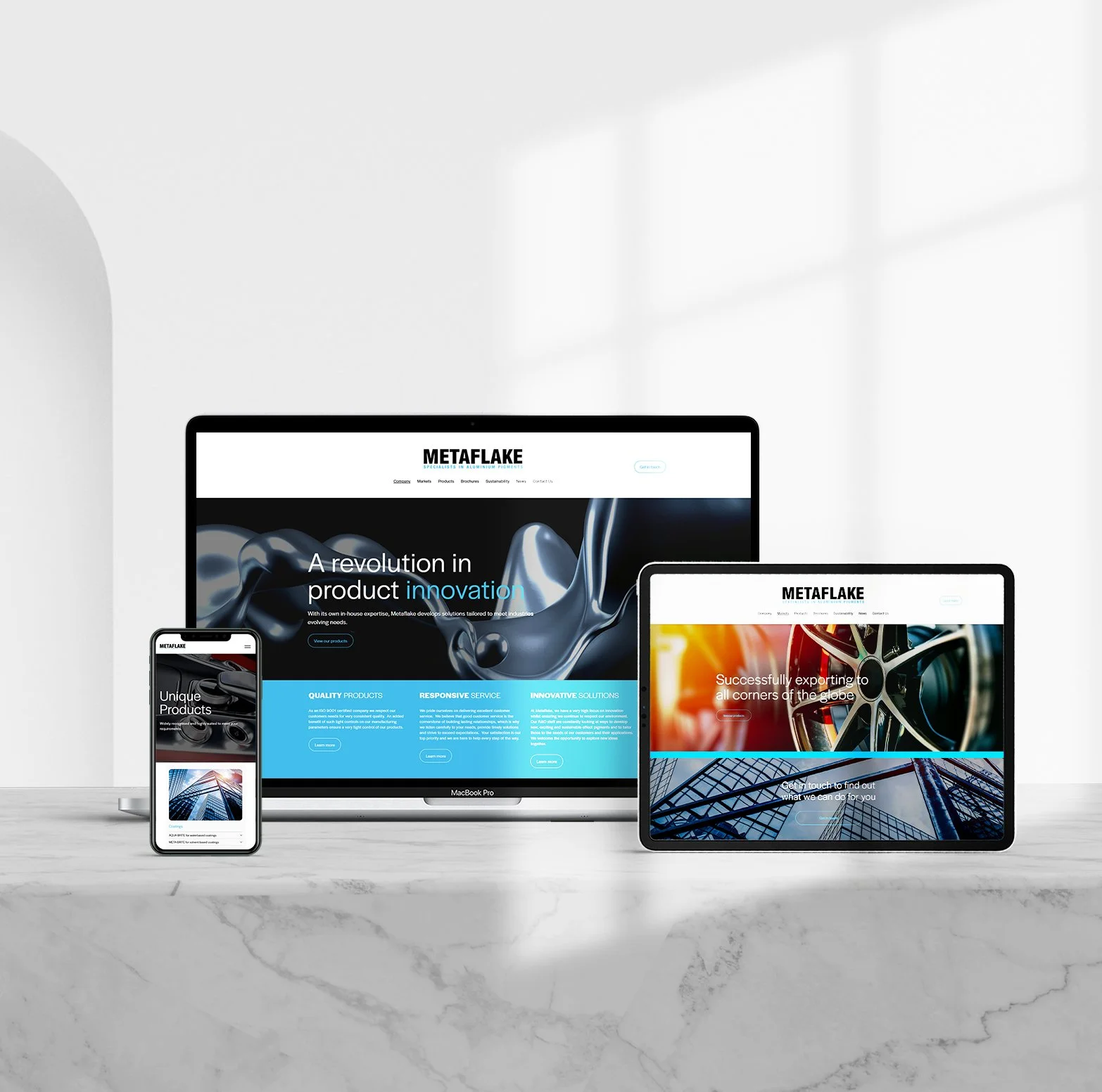


We wanted the look and feel to mirror the kitchens themselves: clean lines, smart space-saving ideas, and zero unnecessary clutter.
For the website, we focused on making the browsing and consultation booking process very straightforward, letting stunning kitchen photography and clever engineering do the heavy lifting.
The branding leans into crisp architectural typography and a sharp, modern grid layout that feels both high-end and welcoming.
The Impact: The new branding and website strip away the usual stress of high-end home renovations. Instead of feeling like a stuffy showroom, Basehaus comes across as a knowledgeable, approachable partner that makes designing your dream kitchen actually enjoyable.
Color Palette: Earthy Neutrals & Soft Monochromes: Ground the brand in natural, premium materials like timber, stone, and matte finishes. Warm Accent Tones: Add a touch of everyday livability so the brand never feels cold or intimidating.
The impact of Branding
Basehaus, German design
The website: For Basehaus, we developed a sleek digital platform built around structured layouts, spacious white frame framing, and effortless navigation.

Focused on highlighting precision hardware and design details, the UI blends minimalist visual storytelling with seamless product discovery for architects and interior designers.
See the website design at www.basehaus.co.uk

